Two custom plush can use the same pattern, the same minky, and the same fill, and still land in completely different places on a shelf — because one has an embroidered face and the other a printed one. How the face and any logo get applied is not a finishing detail. It decides how much fine detail survives, how the toy holds up to a washing machine, how it feels in the hand, and, for anything aimed at small children, whether it clears a basic safety bar. Here is how the main methods actually compare, and why most experienced brands end up combining them.
The Three Ways a Face or Logo Gets Onto Plush
Embroidery stitches thread directly into the fabric, building the design out of thousands of interlocking stitches. Dye-sublimation printing infuses dye into a polyester panel, which is then cut and sewn into the toy, so the color lives inside the fibers rather than sitting on top. Appliqué cuts shapes from contrasting fabric and stitches them onto the body, usually with a satin-stitched edge, which is how big bold color blocks and cartoon bellies are most often done. A fourth option, screen printing or heat transfer, lays ink or a film onto the surface; it is cheap for simple marks but the worst fit for plush, and it is worth understanding why before anyone suggests it to save a few cents.
Detail and Color: Where Printing Pulls Ahead
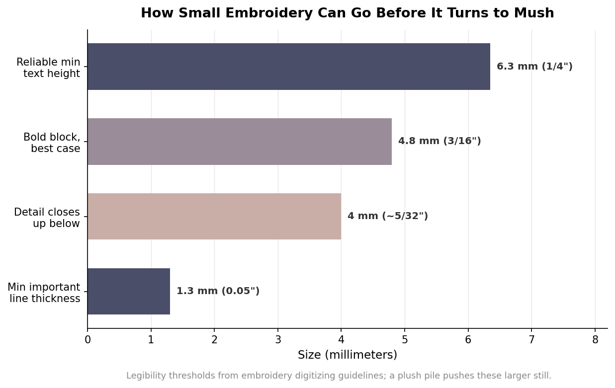
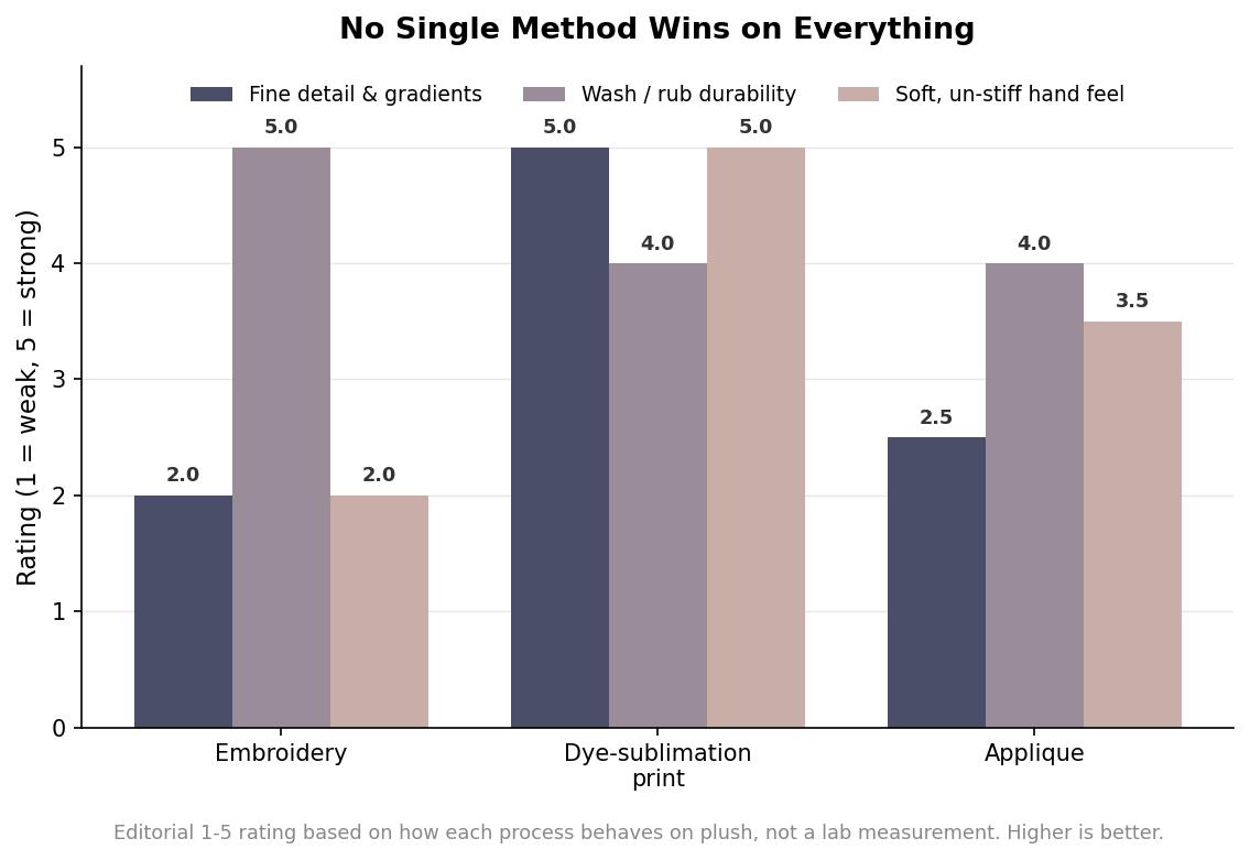
If the artwork depends on gradients, photographic shading, or small text, printing is not just better — it is the only real option. Dye-sublimation reproduces effectively unlimited resolution, so a watercolor sky or a finely shaded muzzle comes through faithfully. Embroidery cannot render a gradient at all; it builds color in discrete blocks of thread, and it hits a hard wall on small elements. Lettering much below about four millimeters simply closes up into unreadable blobs as stitches from opposite sides crowd together, and the interiors of letters like e, a, and o fill in solid. General digitizing guidance puts the reliable minimum text height around a quarter inch, with bold block letters sometimes holding at three-sixteenths on smooth fabric, and important lines no thinner than about a millimeter and a third.
Durability and Feel: Where Embroidery Pulls Ahead
A plush toy gets squeezed, dragged, and washed, and that is where thread earns its place. Because embroidery is mechanically locked into the backing fabric, it survives thousands of rub cycles and repeated laundering without meaningful degradation. Surface prints do not fare as well: screen-printed ink tends to micro-crack as the soft fill flexes underneath it, and heat transfers can start lifting at the edges after only a handful of wash cycles. Dye-sublimation sits in between — because the dye is in the fibers it will not crack or peel, though it only works on light-colored polyester and the colors read slightly softer than on paper.
Feel is a genuine trade-off in the other direction. Embroidery adds a pleasant raised texture but compresses the pile where it sits, which can leave a stiff patch on a high-loft fabric. Printing keeps the surface soft, but on a fluffy material it is prone to “grinning,” where brushing the pile backward reveals the pale base fabric through the print and briefly breaks the illusion of the character.
The Plush-Specific Gotchas
Plush fabric behaves nothing like a flat T-shirt, and both methods have to account for the pile. The fuzzy nap physically hides fine stitching, so embroidery on minky needs a cutaway stabilizer underneath and a water-soluble topping on top to stop the stitches from sinking out of sight, and it rewards solid, simple fills over delicate linework. That same pile is what makes appliqué so useful on plush — a sewn-down fabric shape holds the nap flat and reads cleanly at size where thin embroidery would disappear. Appliqué has its own catch: the cut edges need a dense satin stitch to keep them from fraying over the life of the toy, so it works best with clean, closed shapes rather than intricate outlines. The practical upshot is that every minimum-size rule gets stricter on plush than on woven fabric, and whatever looks marginal on a spec sheet should be sized up before it goes into production.
Safety, Cost, and the Hybrid Most Brands Land On
For anything intended for young children, decoration is also a safety decision. Embroidered eyes and features avoid the hard plastic safety eyes that are a classic choking concern on toys meant for ages zero and up, and stitched features are straightforward to validate against mechanical toy-safety tests. Printed decoration introduces a chemical dimension instead: inks and dyes have to be verified against lead, phthalate, and migration limits under the relevant toy standards. Neither is a dealbreaker, but each points at a different test regime, and that belongs in the plan from the start rather than after the sample arrives.
Cost structures differ too — embroidery is priced largely by stitch count and machine time, so it favors small, simple marks, while printing carries setup cost that amortizes over large, complex areas. Put all of it together and the reason premium plush so often uses both becomes obvious: an embroidered face for safety, durability, and that tactile quality, paired with printed body panels for the patterns and shading thread cannot touch. Treat the figures here as planning guidance rather than fixed rules, and confirm the specifics of your artwork on a physical pre-production sample, because plush has a way of humbling a design that looked perfect on screen.